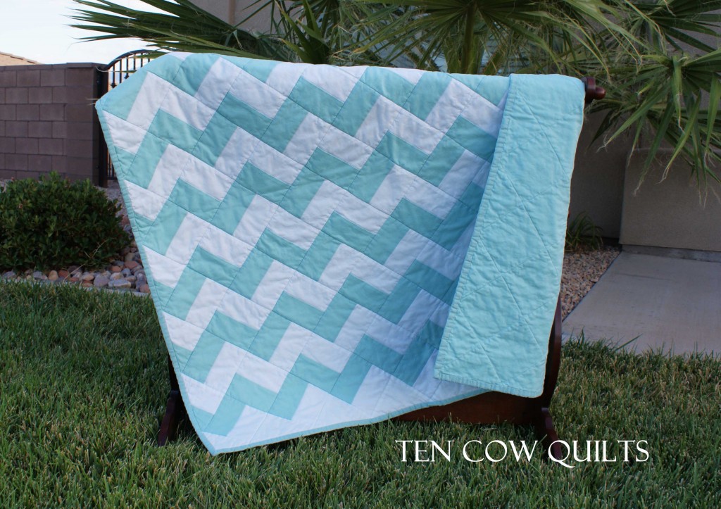
Thanks everyone for the comments left on my last post about which background is better. I really appreciated everyone’s thoughts on that. Now that I have my shop stocked the way I would like it (there are a few more things I would like to add, but I need to sell stuff before I can make more stuff) I submitted my shop to a critique team on Etsy to tell me what I could do better. There were a lot of great suggestions about improvements I could make but the one that surprised me the most was that there were three people that said that they didn’t like this picture. One person said it looks “awkward”.
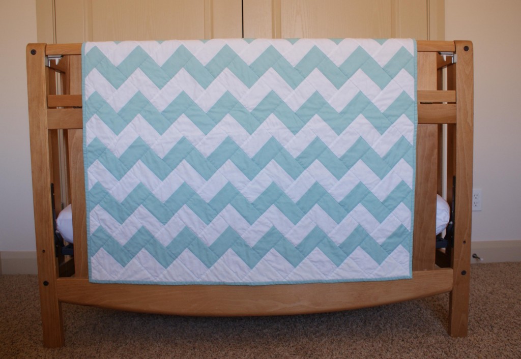
 They all said that the “crib shot” was much better.
 So here I sit, scratching my head, a little bit befuddled. I mean really? The crib picture just looks soo blah. Anyways, I can handle the criticism. I asked for it and they gave it.
Anyhow, I have a great idea for a tutorial. Hopefully I’ll have some time this week and I’ll actually get something interesting posted on this blog of mine. Thanks for sticking around all my wonderful blog friend readers!


I love both shots and the top one is artsy with the position of the blanket. Both are great. winks, jen
LOVE how the quilt turned out! I’ve been really wanting to make one like this, I think it was your pinterest pin that inspired me! As far as the one photo looking awkward, I don’t think it looks awkward, I do like it because of the way it shows the back of the quilt and that it’s a bit asymmetrical, but one thing that might make it a stronger picture would be to simplify the background. I do like the crib photo for that reason, it’s simple and all about the beautiful quilt.
Okay, off to look at your etsy site! You always make such cute, fun things!